
This is the current poster for Young Guns 'Bare Bones Club Tour ' which is advertising their new album, which was released on February 6th. The poster clearly advertises their new album by having the album artwork as the main imagery top central of the poster. The information is is displayed on a darker background which is carried on from the album's background, showing clear links. The album as a whole is displayed in a small square at the bottom right hand corner of the page (including title text etc which the top image does not show). The typography is kept clear and simple using a basic font and white to contrast against the dark background. This is important as the viewer can easily pick out the information. Special fonts are used for band names as viewers can link or relate these fonts back to the band a bit like a logo.

My own poster for my ancillary task uses a similar layout. I have Put the album artwork at the top center so that this is the focal point of the poster. I have darkened the background of the lower half so that it is easy to display information about the album and band. I added a grunge/distressed texture, representative and typical of the rock genre, over the top as well as a purple tone to match the colour used in the CD cover. As the background is dark I have also used a simple white font for the main bulk of information, using a special font to represent the band. As I am aiming to promote the CD/digipak itself, I have included a small image of the actual CD cover with all the text to show viewers what to look out for when trying to find and buy the album. At the bottom, I have included an image of the band members as this is a convention I have found that similar bands use on their own posters.
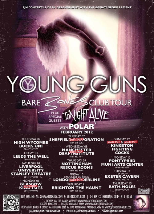 This is the current poster for Young Guns 'Bare Bones Club Tour ' which is advertising their new album, which was released on February 6th. The poster clearly advertises their new album by having the album artwork as the main imagery top central of the poster. The information is is displayed on a darker background which is carried on from the album's background, showing clear links. The album as a whole is displayed in a small square at the bottom right hand corner of the page (including title text etc which the top image does not show). The typography is kept clear and simple using a basic font and white to contrast against the dark background. This is important as the viewer can easily pick out the information. Special fonts are used for band names as viewers can link or relate these fonts back to the band a bit like a logo.
 My own poster for my ancillary task uses a similar layout. I have Put the album artwork at the top center so that this is the focal point of the poster. I have darkened the background of the lower half so that it is easy to display information about the album and band. I added a grunge/distressed texture, representative and typical of the rock genre, over the top as well as a purple tone to match the colour used in the CD cover. As the background is dark I have also used a simple white font for the main bulk of information, using a special font to represent the band. As I am aiming to promote the CD/digipak itself, I have included a small image of the actual CD cover with all the text to show viewers what to look out for when trying to find and buy the album. At the bottom, I have included an image of the band members as this is a convention I have found that similar bands use on their own posters.
No comments:
Post a Comment